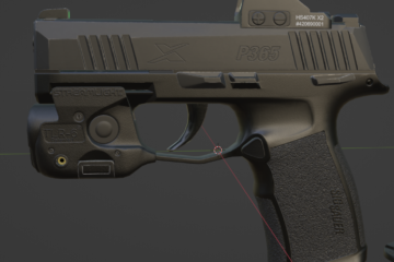
I was doing some additional work on the M1911A1 I made a while back to prepare it for animating, and while I was redoing the textures I noticed a little issue, and thought it would be interesting to document. “But where?” was the first thought that came to mind, and then I remembered I had this site, that has this little news section that I really never post to, and really should. It’s not really news, but this is my site and I’ll break whatever rules or conventions I like!
Anyway, I’d modeled the relevant interior bits of the model, converted that into the low poly and had all my baking done in Substance Painter, and I started to notice some oddities with the materials. Little weird lighting errors on the text engraving I’d done using various floaters (but only some of them).

Specifically, only the text in one font. Everything else seemed fine. So I took a closer look at the baked normal and noticed that indeed, this font was baking oddly compared to others:
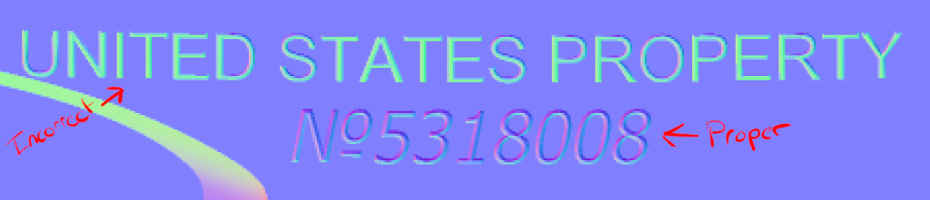
I hopped back to Blender and took another look at the high-poly, and at first glance, everything looks fine…
But when you zoom in really close…
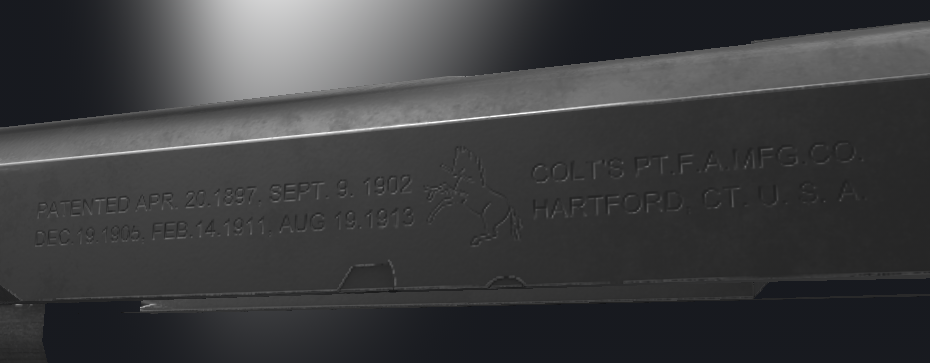
You can just kinda see a little bit that the lighting between the stuff that bakes nicely and the stuff that doesn’t is a little off.
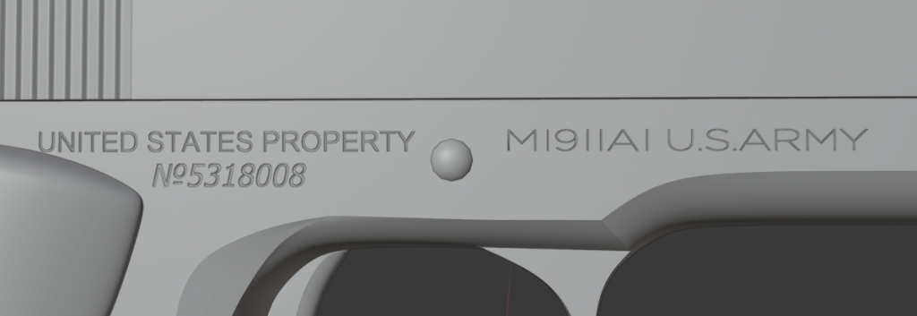
I’d done all this using a few modifiers and just kinda let it do its thing. The settings were apparently a little off; there were some overlapping vertices (probably from the bevels and such I was using), and despite things mostly looking ok, it seems Substance Painter’s baker really doesn’t like that. So I went in, merged verts by distance and marked some sharp edges where they could cause weird shading, and bam. Everything looks pretty spiffy now.


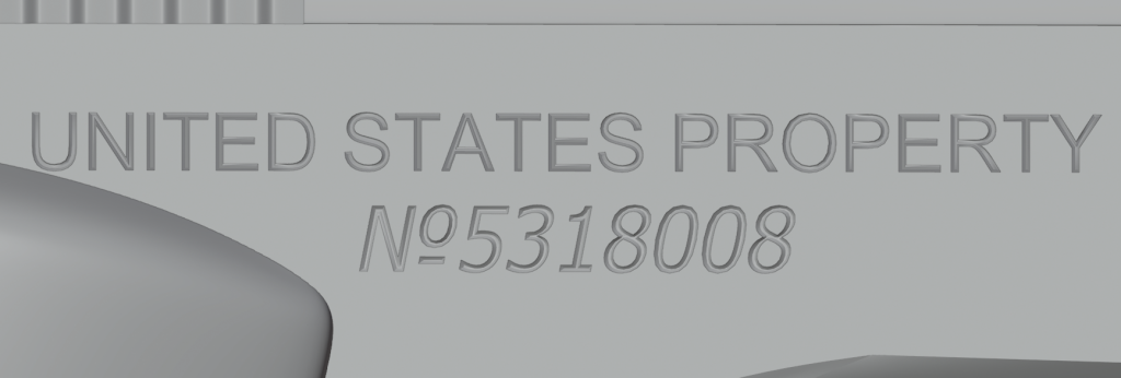
In hindsight, I realize I could’ve done all this as height-maps in Substance Painter, but at the time the text tool was a bit of a pain, and I do like the occasional edge that catches just a glint of wear. That kind of thing is automatic when you do text in the high poly, which is quite nice.